Top 3 ‘Contact Us’ Templates that Get Attention
1,164 total views, 2 views today
1,164 total views, 2 views today
The purpose of any website is to grab eyeballs. The entire digital media works in that very principle. Still, interestingly not many people keep the ‘Contact Us’ page on top of their priority list while building a website. Most of the attention goes to the homepage, or product/service page. This is where most of them get it WRONG!
We all wish… most of our visitors would go one step further & get in touch with us after visiting our website. But it doesn’t happen in most of the cases, because the link to ‘Contact Us’ page lies somewhere in the corner of the footer. I would say that it’s a BIG NO NO.
The ‘Contact Us’ page is by far one of the most important pages on any website. After all it’s the medium through which the prospects interact with you. It should be your sole aim to make this particular page… the most visited page on your website. Wouldn’t that be awesome! 🙂
So, what exactly should an ideal ‘Contact Us’ page have:-
After a lot of research, our content experts have curated 3 ‘Contact Us’ templates which we believe have the potential to yield the best results.
Let’s take a look:
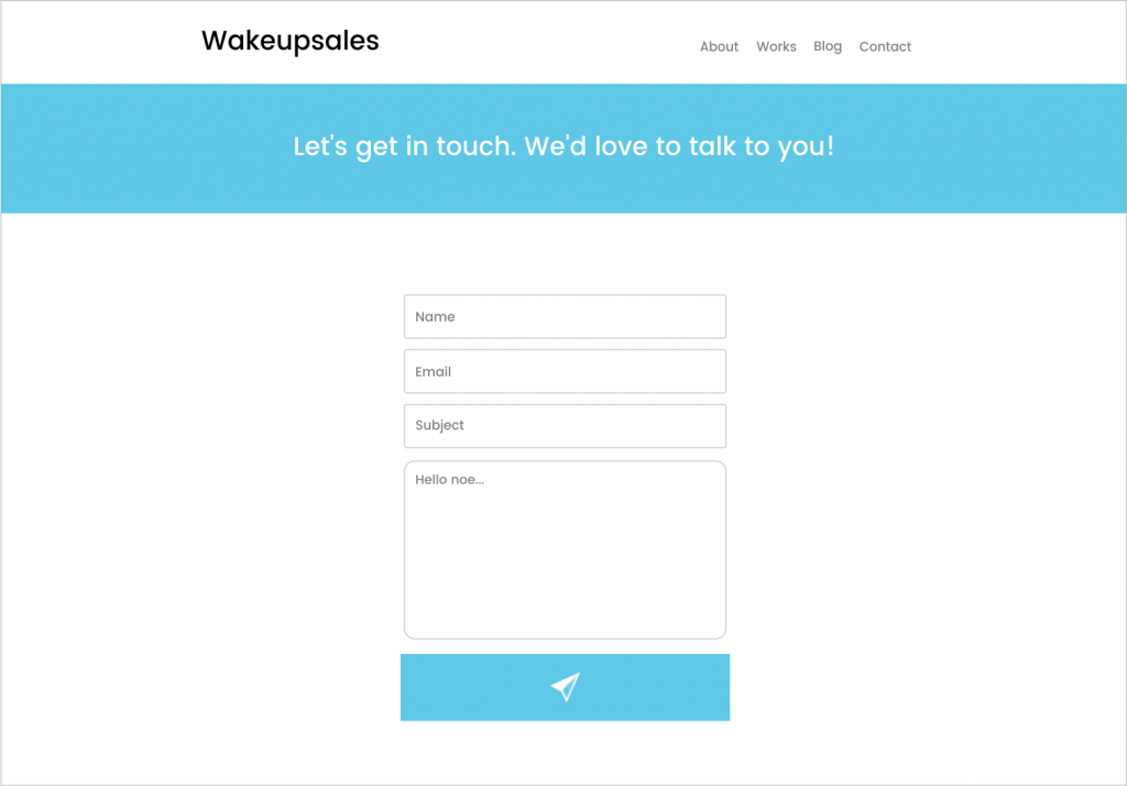
Template – 1
The simplest form, which does the job effectively.

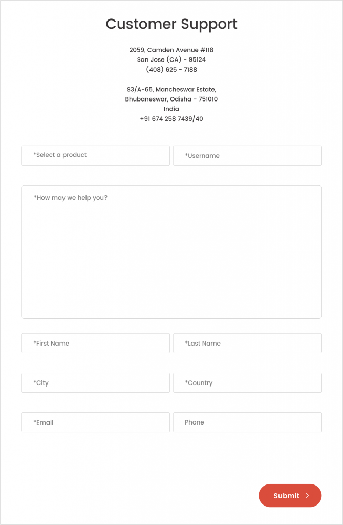
Template – 2
My personal favourite 🙂

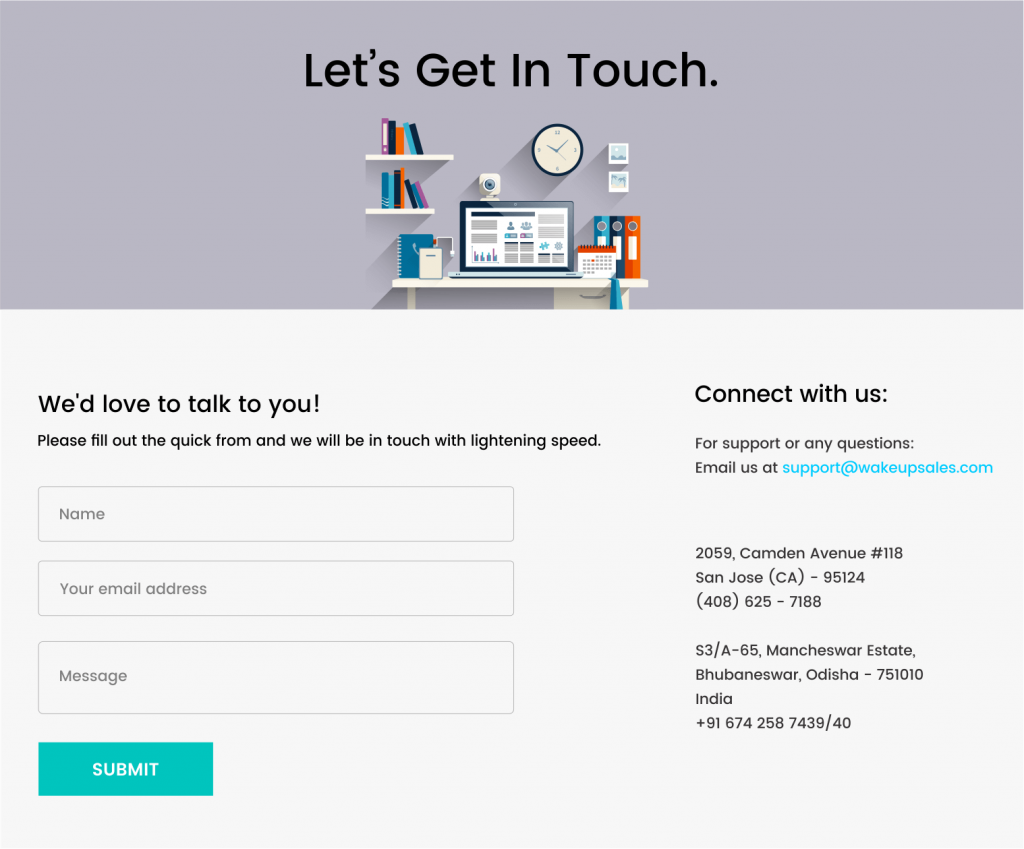
Template – 3
Takes less of space yet gives out everything that’s necessary.

So here are the templates that have worked wonders for us over the course of time.
Give them a look, integrate any of those into your website & it’ll surely make it easy for the visitors to get in touch with you.
Cheers 🙂
