Wakeupsales New UI is Here: Bigger, Better & Easier
1,642 total views, 3 views today

1,642 total views, 3 views today
First, wish you all a Happy New Year! It has been a fantastic journey so far. And this new year, we just had to thank the ever growing 3k user-base that keeps us going. Thanks a ton, Guys!
We had already made tons of improvements to WakeUpSales. Nevertheless, we were just getting started.
Today, I have something BIG to share with you all – we planned this long time and nothing better that the new year to give WakeUpSales a whole new makeover. Something beautiful, which would make using this CRM tool an even better experience. This brings me to…
A Complete New UI Our team has been working hard this holiday season & a new UI will roll out a lot sooner than you think. The New Year celebrations are a story for another time 🙂
What is New?
Getting Started
From the moment you sign into your account, you will experience something that feels new… yet very familiar. The new ‘Getting Started’ page will look something like this:
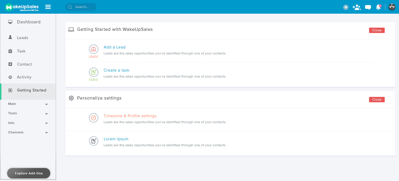
It looks cool & fresh with more clean white and less clutter. The crowd favourite options of adding a lead, creating a task etc. are right where they should be. The menu panel on the left & to the top-right corner now give you more options than before.
Need a hands-on walk through? Schedule one right here.
Dashboard
This is where the new UI really comes to life.
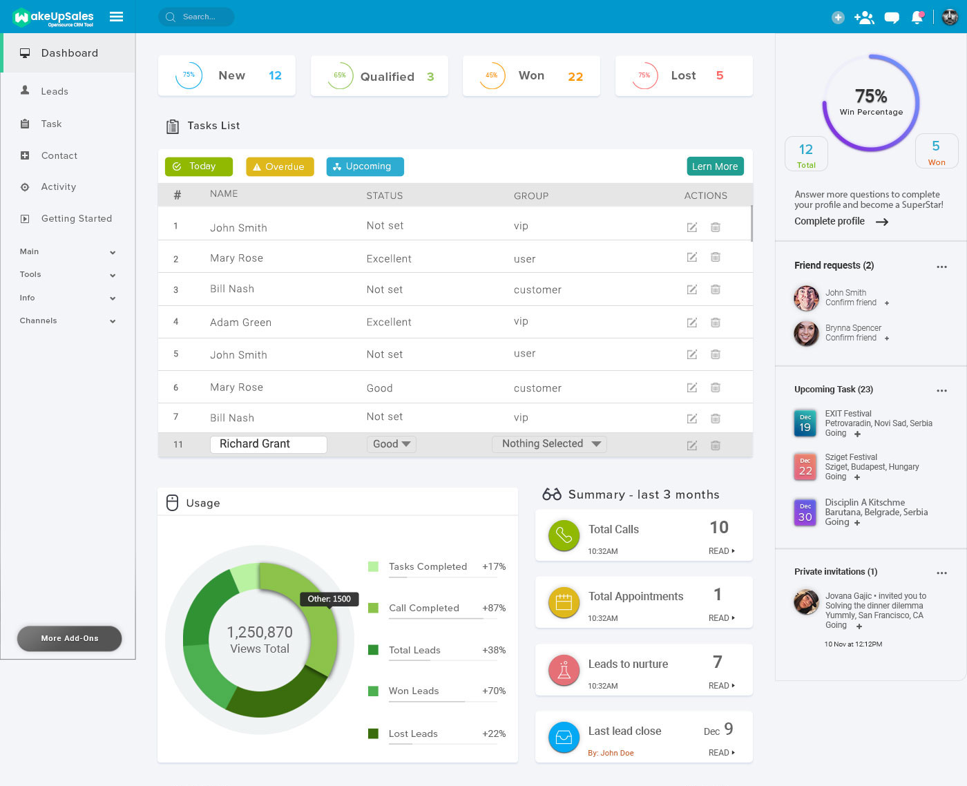
It gives you concise information about almost everything, just in a much better way. Figures, which matter, are now shown in percentages, so that it is easy for you to realise what needs to be done. A new section on the right, gives you a summary of the upcoming tasks & pending invitations. I know – looks interesting and you really have to try Wakeupsales out, to experience everything in detail.
Lead Listing Page
This is another important page we have worked the most on.Take a peek:
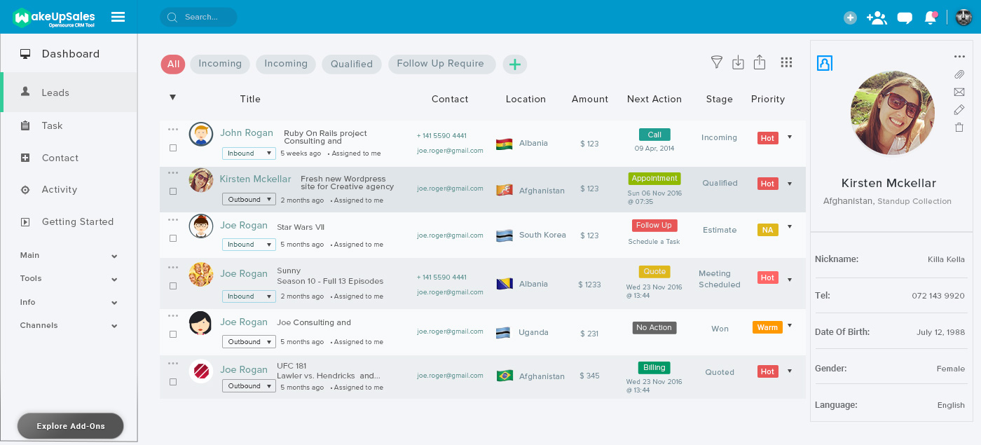
Everything is arranged in a more efficient way. Now, you can also figure out which geographies, majorities of your users are from. In addition, a new section on the right gives you a brief detail about the lead/contact you are interested in. It is so useful. Schedule a demo to know more about it.
Activity Page
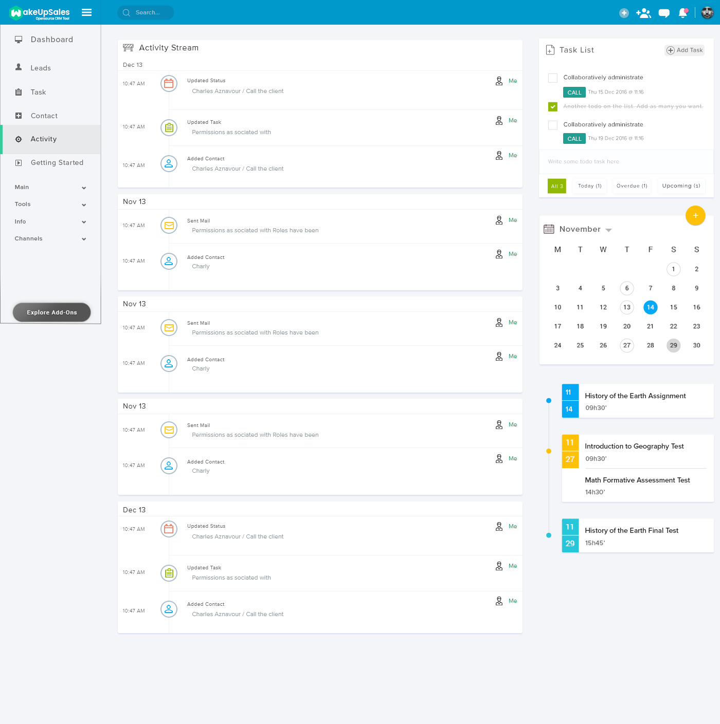
We revamped the ‘Activity’ page with a much cleaner UI, which makes it really attractive to the eyes. Here is how it looks:
Website
With everything being revamped for the better, we could not have just left the website with its old look. So, we have redesigned that as well. It is now a lot more engaging & intuitive, with simple navigation all throughout.
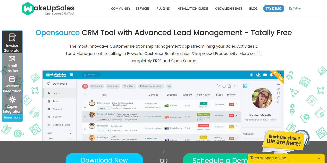
Visit the Website: www.wakeupsales.org
And A Lot More…
Apart from all the BIG updates as said above, there are a zillion small enhancements under the hood, across the application. In addition,we have got even more in store. Moreover, ‘White Label’ subscriptions are on their way as well. Yes, it has taken some time. But, we had to ensure everything’s spot on, before making it live!
And for the curious birds, we’ve already started working on the Android & iOS Mobile Apps for Wakeupsales. Exciting times ahead!We really have a bunch of amazing things to work on this calendar year. Just keep your love coming. It helps!
If you are not on Wakeupsales yet, try a demo right now.You will love it, as it will help run your business better. If not, I want to hear about it. Please leave your feedback below.