What’s New in Wakeupsales – June 2019
5,890 total views, 2 views today

5,890 total views, 2 views today
At Wakeupsales, we always aim to get better every day & provide the best possible experience for all our users. This past month of May was BIG for us; with some really BIG changes both at the front-end & behind the scenes.
This is by far the biggest visual upgrade to Wakeupsales CRM since we started off. A whole-new interface which makes the user experience even simpler and navigation more friendly. Tons of optimization at the back-end have also ensured, the app runs faster than ever before… with close to no loading time.
Let’s take a sneak peek:
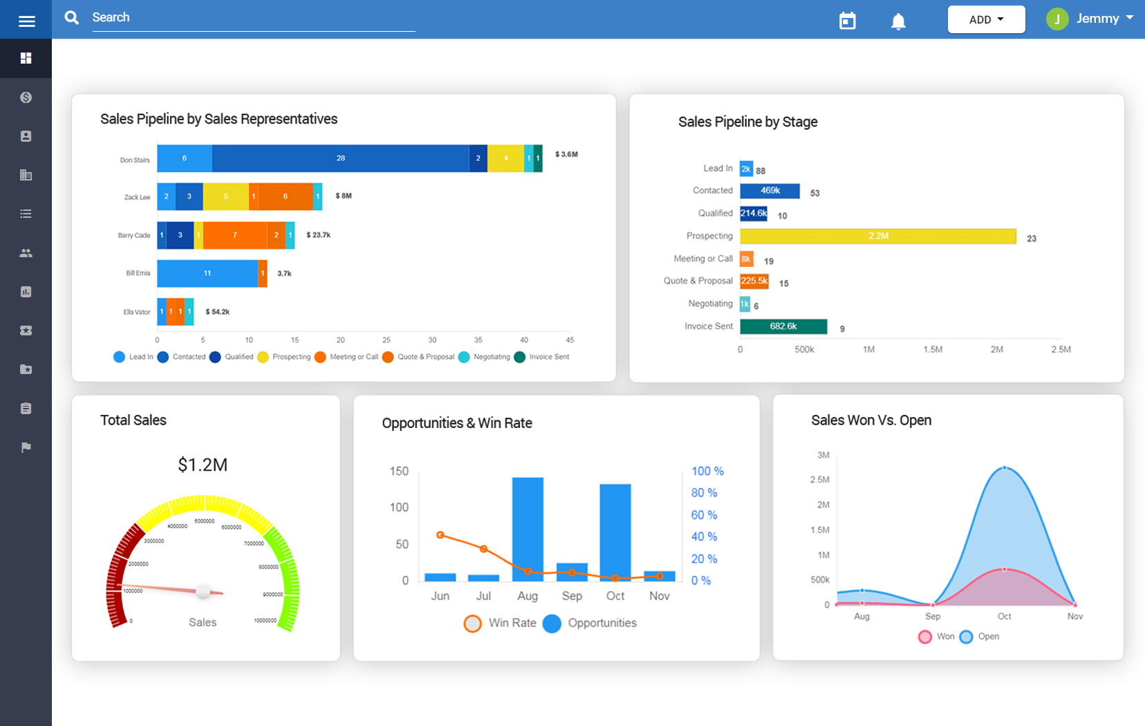
The all-new dashboard now gives you more information in a beautifully curated layout.
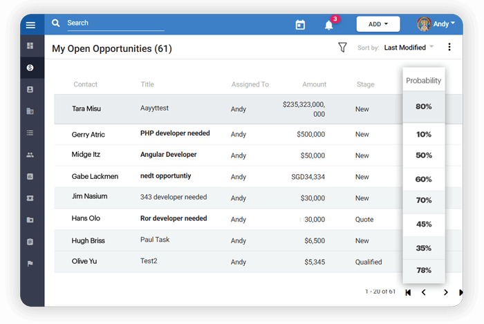
The ‘Lead Details’ page looks better than ever before, & yet gives out all the important info that matter.
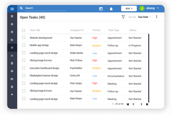
Creating & managing tasks is a walk-in-the-park in the New Wakeupsales!
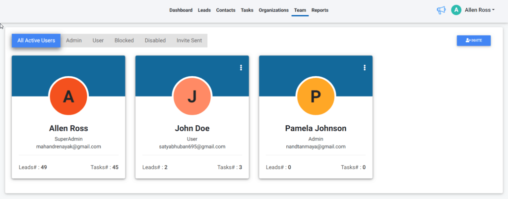
The new ‘Team’ page makes it even easier for you to invite others to your team & manage them. Looks stunning too!
We have worked really hard to make the new interface feel fresh & fast, yet so familiar. I’m sure you’ll love spending more time, doing more… on Wakeupsales now 🙂
***All our new users would be able to access this new interface right away. And we will start moving our existing users to the new version, gradually.
If you’re not on Wakeupsales yet, SignUp today!
For almost 2 years now, Wakeupsales has been widely accepted as the most preferred CRM for small businesses across the globe. The entire team of Wakeupsales can’t be more grateful.
We are so excited about the new interface & can’t wait for you to try 🙂